William Morgan: State-sponsored kitsch
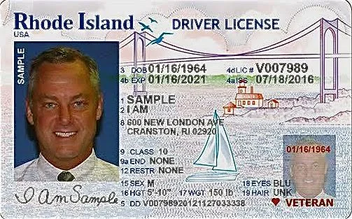
The new Rhode Island Driver [sic] License features I Am Sample, a veteran with unknown hair.
The embarrassingly amateurish design of the new Rhode Island driver’s license once again raises the issue of who is responsible for the visual branding of the state I live in.
So, you may say, it is just a daily-use piece of plastic, akin to a credit card, something you show to cash a check, buy booze, or hand over to the policeman when you've been caught in a speed trap. Like an auto tag, in its small but ubiquitous way the license can serve as an ambassador of the state. Sadly, this wee but official document says volumes about how we identify ourselves and about our self-confidence as a civic entity.
What if the new driver 's license were your primary business card? Do you think that you would impress a lot of potential clients with your classy image?
What would happen, say, if you were wrongly arrested by the secret police in a banana republic somewhere and you flashed your Little Rhody license with its kiddy coloring-book graphics? Your captors might be dazzled, but more likely they'd laugh out loud.
What about the guffaws that would come from notable graphic designers if the new license were entered in a contest to showcase the imaginative designs solutions emanating from the "Creative Capital" (as Providence’s branders call the city)? Instead of "Cooler and Warmer," how about "Cheaper and Uglier"?
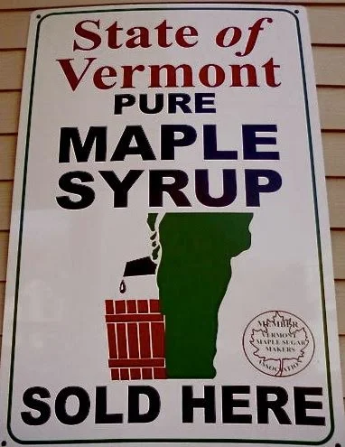
But most states have real shortcomings when it comes to designing their images.
One hesitates to ask how this unfortunate logo got approved.
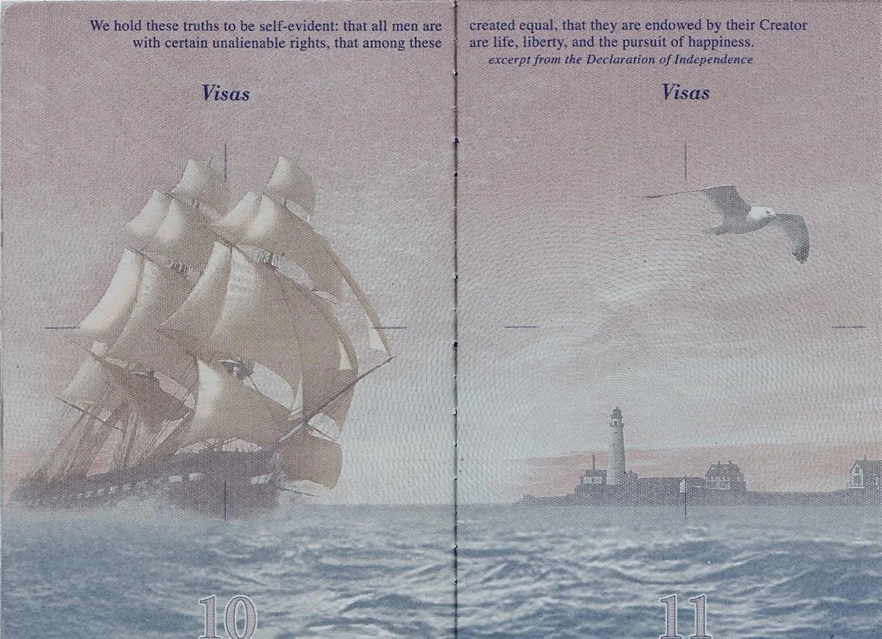
And then, too, logos and branding that come out of the federal government are often substandard. The usual Hallmark Card-meets-Soviet Realism design approach is well demonstrated by the George W. Bush-era redesigned U.S. passport, with its grade school textbook-style illustrations.
A page from the overhauled U.S. passport, complete with the U.S.S. Constitution, a lighthouse, and seagulls (not unlike Rhode Island’s new license). Additional pages in the passport show the Liberty Bell, Mount Rushmore, cowboys, Indians, farmers and other hackneyed subjects.
Rather than bemoan America's low level of visual literacy, let's ask why Rhode Island, with its supposedly high proportion of artistic brainpower, cannot produce less pathetic symbols and slogans. With the exception of the "wave" license plate (a handsome and distinctive design by native and noted RISD graduate Tyler Smith), most of the state's recent efforts to promote Rhode Island have bordered on the woeful.
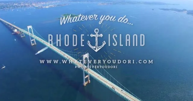
"Whatever you do … " What kind of slogan is that? This is the sort of result you expect from a slick advertising agency. Like the license, this focuses on Newport and Narragansett Bay, as if there are no inland towns, such as Burrillville, Smithfield, Foster or Glocester.
Perhaps the most egregious aspect of pumping up Rhode Island is the effort to give the state a new motto: Beautiful. What does that mean? That it was not beautiful before, but is now? Is it more beautiful because we tell our visitors and ourselves? Are we so insecure that we need an official state campaign to make us feel better about ourselves?
The "Discover Beautiful Rhode Island" signs placed at its borders are in themselves handsome objects. But what is their point? That Rhode Islanders may live there, but have never chosen to be curious about their habitat? Does beauty include the grittier parts of Central Falls, Cranston and Pawtucket? Ultimately, these bits of boosterism are just more distraction on the highway, as meaningful as another Cardi's or Alex + Ani billboard.
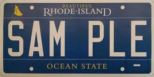
While the proposed "Beautiful Rhode Island Ocean State" (what a burden for such a small place!) license plate has been put on hold – permanently, let us hope, its design is yet another example of our design malaise. The Ocean State moniker is still there, the handsome anchor is gone, but a tiny wall-flower like "Beautiful" has been added, as well as the awkward thumbnail-sized blob of a Herreshoff racing yacht – but lacking the graceful lines of the real thing.
Whether designing license plates, welcome signs, stationary, or drivers' licenses, one solution may be found in keeping it simple. We already know how beautiful Rhode Island is (or isn’t). But let us be mysterious, low key and tease people into wanting to come here.
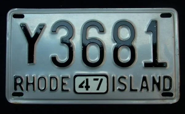
Rhode island license plate–made of aluminum because of World War II steel scarcity–was like a basic black dress: understated, yet oh so elegant.
William Morgan is Providence-based architectural historian who is interested in all aspects of design. He has been variously licensed to drive in several states, including New Jersey, Kentucky, Maryland and Mississippi, the last three of which identified him by race. He is licensed to drive reindeer in Finland.
