The R.I. license-plate-design crisis continues
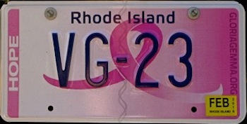
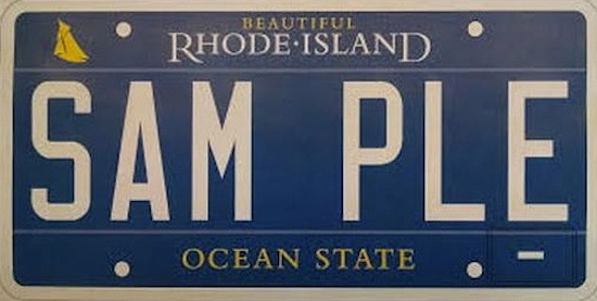
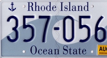
There is something about a bureaucrat that loves a poorly designed license plate. Only three weeks ago I was railing against new pink breast-cancer plate as an example of inexcusably deficient graphic quality. In that time, the State of Rhode Island and Providence Plantations, apparently tired with its "Wave" plate designed by the famous designer and RISD graduate Tyler Smith, has come up with an aggressively bland replacement.
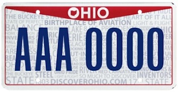
To begin with the letters are now all digitally printed, rather than embossed. Despite what 3M lobbyists may tell you, flat letters are not more visible. Rhode island has been about the last hold out with raised letters, which are not only more readable, but they are more elegant.
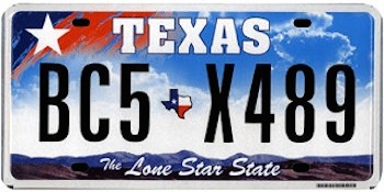
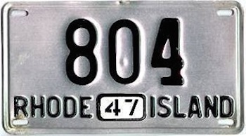
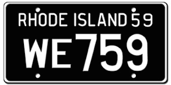
Which of the plates below is more legible?
The blue may be handsome, but its punch is mitigated by the white border, which tends to bleed out the blue. Using gold for the sailboat (which is too small to be really read properly) and the double mottos is just a little unnecessary glitz.
Why does a license plate even need a motto? Does the happy phrase "Ocean State" make us like ourselves more? Does it really boost tourism?
And as for "Beautiful," this new slogan that is being applied to roadsigns across Rhode Island is both superfluous (either our state is beautiful or it is not) and a mark of insecurity (do we really need to be told, are we not smart enough to figure it out, or is is like a creme that promises to make us feel more attractive?).
What is really sad is that past Rhode Island plates have been absolute winners in terms of dignity and superior design. Instead of adopting this undistinguished blue bit of blah, let us go back to the no-nonsense plates of the past. No mottos, so cheap boosterism, just our name.
