It has been a long time since the Massachusetts license plate was a model of good design. The Commonwealth was one of the first states to issues plates back at the beginning of the 20th Century, and during that early porcelain tag era was one of the few states that actually manufactured its own.

One of the porcelain tag makers in the early days of the automobile.

With the exception of the plates with the codfish logo in 1928 and 1929, most Bay State plates have been decorous, no-nonsense affairs.

From my college years, I remember the simple MASS plate. The background color was rotated every other year from black, to cranberry, to a rich dark green. The numbers were embossed and legible.

But 20 or so years ago, Massachusetts adopted the reflectorized surface, started to play with various "Olde Tyme" typefaces, and added the motto:“The Sprit of America’’. (Since Americans are fuzzy about the meaning of Lexington and Concord, one could be forgiven for thinking the moniker meant some kind of booze.)
While still way behind, Massachusetts seems to be trying to catch up with those states that crank out dozens if not hundreds of specialty license plates, complete with puppies, space disasters, endangered animals, household pets, sports teams, political slogans, various cancers and everything in between. Some recent Massachusetts offerings celebrate Cape Cod & Islands, Nantucket and vegetables.

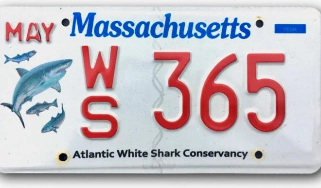
While we Americans manufacture irony by the bucketful, we rarely appreciate its nuances. A recent appearance is a plate that that touts the need to conserve white sharks. One doubts that family and friends of Arthur Medici, the 26-year-old who was killed earlier this month by a Great White while swimming off Cape Cod, will be applying for this plate.
(Will there be a Save the Seals plate soon? Seals are a favorite food of sharks.)
From a design standpoint, one of the most egregious plates is the recent issue, LOVECAPEANN.COM. Who does not love Cape Ann? Yet an area known for brave fishermen and noted artists deserves more than this trite graphic disaster.

The Cape Ann Community Foundation, which will use the extra plate fee for promoting economic development and education, had a contest to find a design. The winner was Annalei Babson, a native of Rockport, who calls herself a branding specialist.
She gave the plate four wee pictograms–from Gloucester, Rockport, Essex and Manchester, along with an artist's palette. The triteness of the presentation makes one shudder to think what the other love fest schemes looked like.
But there is a more positive – or at least, happy – take on one couple's LOVECAPEANN plate. Susie and Don, who live in Hamilton, applied for the number 143, as in I love you, for Susie's Hyundai. Don went one better and got 1432.

William Morgan writes on architecture and design from Providence. His Rhode Island license plate is OX. He’s the author of, among other books, The Cape Cod Cottage and Monadnock Summer.