Vox clamantis in deserto


William Morgan: Ruminating on the mysteries of the wasteland outside Savers
My wife, Carolyn, and I go to a Savers thrift store at least once a week. The five stores around Providence vary in quality, but the mother ship is the Savers on Branch Avenue, tucked between Interstate 95, the main line railroad tracks, and a scrap-metal yard. Carolyn goes in search of fabric, and I go to the bookshelves (what we call “The Library”) to find suitable reading that I will enjoy on an old couch in the furniture department (“The Lounge”).

The author reading at Savers.
_ Photo by Gabs Choinière. All other photos by William Morgan

The best part of my Savers experience, however, is taking a ramble around the parking lot and the scruffy land behind the store. This is a nasty patch of ground, yet its detritus – discarded wrappers, toys, bits of metal, and unrecognizable bits of trash – suggests a surreptitious nocturnal community. While not the ruins of Pompeii, say, these artifacts speak of an urban wasteland and plain American sloth. Surely, there are stories to be told here.
What of the child’s potty at the edge of the tracks where the MBTA and Amtrak trains roar past? This has been in the same spot for several months – presumably the child is now toilet-trained. Was it thrown from the train over the barbed wire from behind the Savers loading dock?

Depressing and sad, one expects a certain amount of drug paraphernalia. But then there are inevitably those little mouth harps on the asphalt. Is there a strong urge among Savers patrons to floss their teeth in the parking lot? Or, as I have been told, do these flossers have something to do with the partaking of illegal substances?
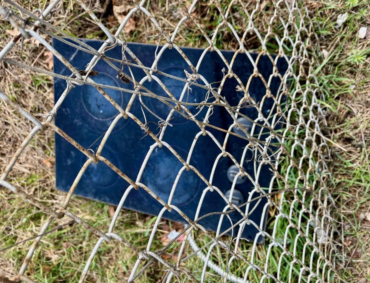
A recent perambulation lead me a stove top jammed up against the chain link fence separating Savers from the highway. Was the 4-top burner tossed from a speeding automobile, in the hopes that it might bounce as far as the store’s donation platform? Was it, perhaps, a dream prop for a homeless person?

And then there are ever-curious of bits of clothing. How exactly do jeans and a blue shirt get here? Perhaps someone, undressed for a tryst on the grass, fled suddenly when a flying stove top came sailing through the air?
Aside from fabric that comes into Carolyn’s workshop from Savers, not to mention almost my entire wardrobe of L.L. Bean, J.Crew, and Brooks Brothers castoffs, the store’s jetsam and flotsam could attract sociologists or archaeologists looking for suitable master’s thesis topics. Or perhaps there’s a new genre of Providence mystery writers waiting to spring out of the contaminated soil on Branch Avenue.
William Morgan, a Providence-based writer and photographer, has been contributing stories on cultural artifacts to the New England Diary for many years. He is the author of numerous books, including The Cape Cod Cottage, Monadnock Summer and Academia: Collegiate Gothic Architecture in the United States.
William Morgan: Coin honoring traitor and wanna-be tyrant Trump reflects America’s moral rot

PROVIDENCE
Seemingly prepared to bypass this nation’s historical aversion to monarchy, our extremely narcissistic Apricot Toddler sees himself as a Roman emperor, perhaps Nero or Caligula. In college, I recall reading Edward Gibbon’s The History of the Decline and Fall of the Roman Empire. In the opening chapter, published in 1776, the great English historian notes that one of the surest indicators of an empire’s impotency is the diminished quality of the design of its coins. The announcement that the U.S. Treasury will mint a one-dollar piece with Trump’s face on both sides is a harbinger of the inevitable implosion of the reign of Trumpus Anti-Americanus.
The double-Trump dollar (surprisingly, not in gold) typically violates laws and traditional shibboleths, such as depicting a living person on currency (banned by Congress in 1866), to say nothing of a lack of modesty and dignity. The obverse leonine profile of the wannabe dictator is a handsome enough rendering, perhaps inspired by another living person depicted on contemporary currency, Britain’s King Charles.
The reverse, however, with its depiction of the assassination attempt during the presidential campaign, is on a par with the weakest Soviet realism. Far too detailed for a coin, it is crowded by the echoing “Fight Fight Fight’’. “Liberty,” mandated for all currency by Congress in 1782, is pretty simple to grasp, but what to make of Trump’s trite football cheer?

British 5-pence coin at left; 5-pound coin at right
Theodore Roosevelt, a neither culturally hollow or aesthetically challenged president, was concerned about the visual message of our currency (“I think the state of our coinage is artistically of atrocious hideousness”), recognizing that good design spoke of the symbolism and perhaps the probity of the government that issued it. T.R. hired America’s greatest sculptor, Augustus Saint-Gaudens, to personify Liberty as a goddess in the best classical manner. The Saint-Gaudens “double eagle” was in circulation from 1907 to 1933.

The beauty of the Saint-Gaudens $20 gold piece notwithstanding, the Trumpian deification dollar is right on track, seemingly nearing the end point of a string of declining visual signposts from the U.S. Treasury.
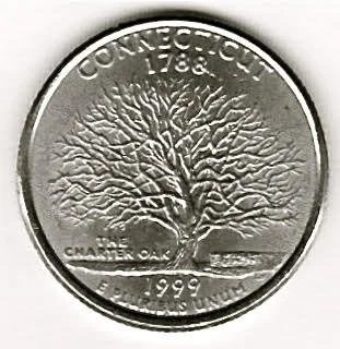
The state commemoratives, starting in the late 1990s, serve as examples of a worsening design sense. One of the early strikes, Connecticut, was almost excellent. The Charter Oak is a potent symbol, and its rendering demonstrates an understanding of the nature of a coin, that is not being a “picture’’. Alas, the dates and the legends add unnecessary clutter.
The nod to Ohio, three years after Connecticut, hasn’t a clue of what a coin ought to be. The design is a crowded mess. There’s the map of the Buckeye State, a faceless and footless Neil Armstrong on his moon walk, and the Wright Brothers’ plane (which flew not in Ohio, but in North Carolina).

When there were no more states to pimp, the Mint began issuing quarters featuring places (the White Mountains, say, or the Florida Everglades – landscapes are not ideal for the miniature circular canvases) or people (Helen Keller, Duke Ellington) or events (the Homestead Act).
Almost all of the quarters featuring people border on the grotesque, but that honoring the late Hawaiian Congresswoman Patsy Mink serves as exemplary of the low quality of noted-people portraits. Here we are offered a dog’s breakfast of competing detail: Patsy’s name, the U.S. Capitol, Title IX legislation, a lei, “Equal Opportunity in Education’’, and what looks like an erect right nipple. No one, even a politician, deserve such an embarrassingly artless tribute.

The Trump dollar is, thus, not all that unusual: the nadir of a bad stretch in the numismatic wilderness. It is not coincidental that it arrives following the imminent cessation of the minting of the one-cent coin. While there may be economic reasons for ending the life of the penny, a chief reason is arguably that it features Abraham Lincoln. Honest Abe’s presence on the penny is a constant affront to our most dishonest, traitorous, and authoritarian president.
Our coins are cultural barometers, and the Trump double dollar is the perfect reflection of the moral rot that threatens our republic.
Architectural historian and photographer William Morgan writes about design in all forms, including cities, architecture, landscapes, and license plates. He is the author of Academia: Collegiate Gothic Architecture in the United States, among other titles.
William Morgan: An Arizona developer’s dream of London Bridge in the desert
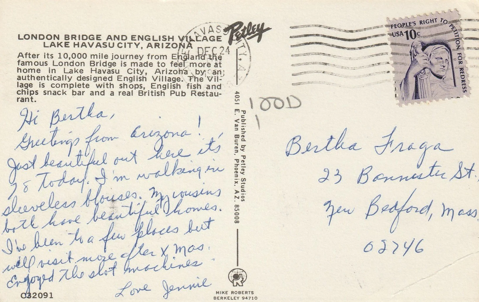
On Christmas Eve in the late 1970s, Jennie wrote a postcard to her friend Bertha Fraga back home, in New Bedford, Mass. There’s a bit of Schadenfreude on Jennie’s part: Bertha’s address is a triple decker in a run-down area just a block from Interstate Route 195.
As opposed to gray skies and snow flurries in the old whaling port, it is “Just beautiful out here it’s 78 today. I’m walking in sleeveless blouses. Both my cousins have beautiful homes.”
Jennie probably visited the Grand Canyon while on her trip, but her postmark puts her at Arizona’s second-most-popular tourist spot, London Bridge.
The Lake Havasu City bridge was purchased a decade before by a local businessman for $2.5 million, spending another $7 million to get the famous l830s landmark shipped from the Thames to the lake and reconstructed. (The Lord Mayor of London traveled to lay the cornerstone.)

London Bridge in Lake Havasu City, Ariz.
While undoubtedly an urban myth, there was some speculation that the Arizona developer believed that he was purchasing the much larger and far more ornate Tower Bridge. As it was, only the external granite blocks of London Bridge were taken to the Arizona site, next to the Colorado River, where they were attached to a new steel and concrete frame.
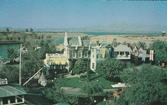
English Village at Lake Havasu City.
In trying to increase the visitor appeal of his planned city, the developer constructed “an authentically designed English village” to make the London Bridge “feel more at home.” Looking like a movie set from an old Western, the village boasted an “English fish and chips snack bar and a real British Pub Restaurant.”
Not surprisingly, the village expanded, as, promoters say, “local entrepreneurs and dreamers saw its potential and reimagined the space as a hub of family fun and entertainment.” Hit this link.
The Hog in Armor pub is now a microbrewery. As official Lake Havasu PR asserts, “the English Village remains a beloved destination for making memories … and feeling the magic of reinvention done right.”
Jennie may have been dazzled by the desert sun and the English Village’s cute shops, but score points to Bertha for living in an architecturally rich town with real, unmanufactured history.
William Morgan is a Providence-based architectural critic and historian and photographer. He has been contributing stories on New England’s quirky heritage to New England Diary for years. His book The Almighty Wall is about architect Henry Vaughan, who designed the original building of the Whaling Museum in New Bedford.
William Morgan: Why we need writing on architecture
Conversion and expansion of the old Miriam Hospital, in Providence’s Armory District, into apartments. Jack Ryan is its architect. He was recognized with two awards at this year’s AIA-RI annual dinner.
— Photos by William Morgan
Remarks on receiving the ARCHISTAR award from the Rhode Island chapter of the American Institute of Architects at its annual on Nov. 6.
Some years ago, a visitor to my mother’s home, saw one of my books on the coffee table. and declared, “William Morgan. He’s a famous architectural historian.” “No, he’s not” my mother replied, “He’s my son.”
So, it is nice to be recognized. Thank you, AIA – Rhode Island.
When I was the age that kids dream of future careers as astronauts, brain surgeons, or firemen, did I want to grow up and be an architecture critic? No. But from the first lecture in Art 1 in college, I knew my life would be in architecture. Torn tracing paper at Columbia’s architecture school demonstrated that my path would not be as a designer. So, instead I became an historian, and, I hope, an advocate for the role of good architecture.
My wife, Carolyn, and I chose to move to Providence over 25 years ago. We had a list of what might be our ideal places, but we came largely because the city was so rich architecturally, so damned attractive, so human-scaled. (We were snowed by the idea that the city was removing the I-195 overpass from downtown.)
While teaching in the architecture school at Roger Williams University, I started writing for The Providence Journal. I also spent a couple of years as architecture critic for Art New England. (I was let go when I refused to remove the line that “Brown had the lowest architecture I.Q. in the Ivy League” from an article about Rafael Viñoly’s Watson Institute building.) Many of you may know me from my dozen or so years with GoLocalProv.com. I also wrote for Design New England’s entire run, until The Boston Globe decided to shutter the award-winning magazine.
Architectural writing of any kind is more important than ever. The Mother of the Arts is being marginalized, and there needs to be more conversation, more public discussion of the built environment. There have been so many losses, so many failures.
For example, the stupidity of the I-195 makeover of a big chunk of downtown Providence – a tremendous civic opportunity that has been squandered. The bland leading the bland. Not to mention the victory of architecturally illiterate developers, and the triumph of the second-rate.
Good architecture has to compete with, and often cede ground, to “design build,” or building plans available on the Internet for a few dollars. And then there is the challenge of Artificial Intelligence.
If your aim is only to monetize your abilities –that is, if the bottom line is always more important than aspirations or art, you are bound to lose what really matters. And what about the inability of government to maintain bridges and roads, much less plan an intelligently constructed and well-designed commonweal?
Trump’s destruction of the East Wing of the White House should remind us of political leaders who understood place and symbol-making. Harry Truman insisted that a crumbling people’s building had to be restored, not replaced. Woodrow Wilson, who designed his own Tudor revival house, did much to create the Collegiate Gothic campus as president of Princeton University.
(The original East Wing was built in the early 19th Century and later torn down, while the version Trump demolished was constructed under Franklin Roosevelt in 1942 with the design by government architect Lorenzo Winslow.)
FDR not only designed his presidential library, in Hyde Park, N.Y., and the wooden case for the East Room piano, but wrote about Dutch Colonial architecture in the Hudson Valley.
And, of course, Thomas Jefferson, who was not only the brightest man in the land, but who believed in architecture’s fundamental role in defining our republic. Like it or not, we will be judged by our buildings.
The design profession – rather than politicians, contractors, or money men–needs to become the voice of planning that lifts the city and landscape out of the doldrums of mediocre vision into buildings and spaces that support human connection and raise the human spirit.
Thank you for this award, and for all that you do to fight the battle for good architecture.
Architectural historian, critic and photographer William Morgan’s books include Academia: Collegiate Gothic Architecture in the United States and The Cape Cod Cottage
Block Island house by Estes Twombly Architects, the Newport practice with probably more AIA-RI awards than any other firm.
A dwelling for us

Adapted from Robert Whitcomb’s “Digital Diary,’’ in GoLocal24.com
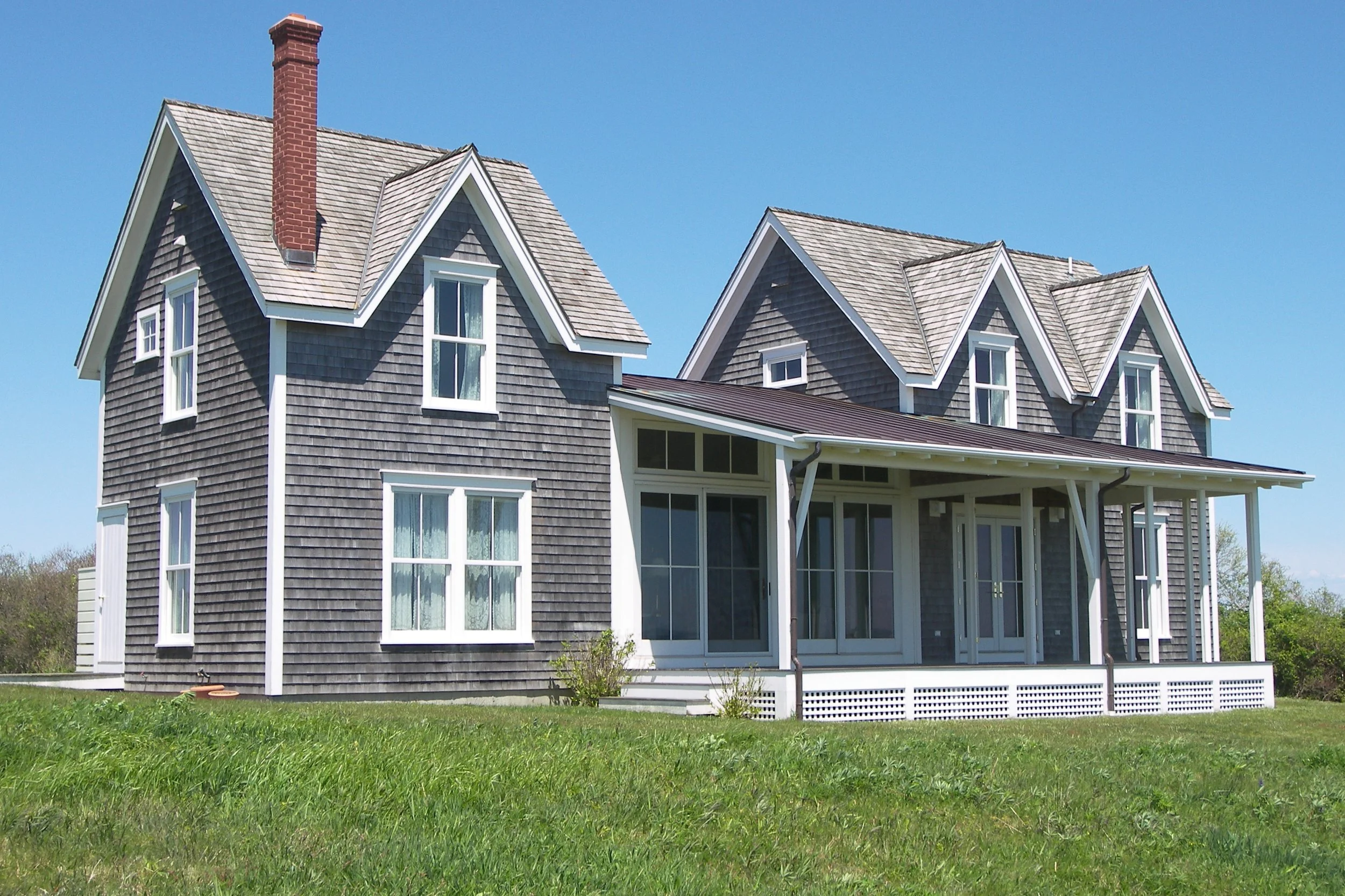
Architectural historian and critic William Morgan’s book The Cape Cod Cottage tells the story of an architectural style that started in southeastern Massachusetts as 17th Century colonists’ adapted English houses to our hardy climate. The low-to-the-ground and one-to-one-and-a-half-story dwellings, with center fireplaces and steep roofs with gables, were modest buildings that evoked the practical and aesthetic attributes of the Puritans/Pilgrims.
Mr. Morgan’s history-rich essay and the terrific collection of photos, most by him, that follow make this little book a joy.
Sided with cedar shingles, which in the region’s damp, windy and salty wind turn gray, or with simple clapboard, Cape Cod Cottages from the start evoked a calm domesticity.
Many old Capes have been, to say the least, heavily modified since those early days, with, for example, porches, wings and floors added on, not to mention garages with big ugly doors. Some new alleged “Capes” you might hardly recognize as in that style – too big and pretentious -- McMansions. But the simplicity of those that adhere to the original need or desire for simplicity and economy have continued to lure buyers. Note how many of the post-World War II housing developments, such as the Levittowns, featured small Capes and “modest Capes’’ are still being put up around the country, even in such places as deserts Out West.
I have generally happy memories of my Cape Cod relatives’ cedar-shingled Capes. The newer ones (built since the 19th Century) have two full second floors, but the basic house design was the same. If there was a water view available, lots of owners would stick a porch on that side, often glassing it in.
I well recall the oddly pleasant musty smell (maybe allergy-inciting for some people) of these cozy houses, up from the immediate shoreline in cedar and oak woods , and connect it with my laconic and ironic grandparents and other relatives down there, descendants of Puritans, Pilgrims and Quakers. They never seemed to swear and used phrases such as “don’t-cha-know?” (instead of “you know?’’) and “don’t give me any guff’’ that I haven’t heard for a very long time.
(This book was originally published in 2006 by Princeton Architectural Press in paperback. It’s now being reissued in hardcover by Abbeville and with a new cover design.)

William Morgan: Ruminations on an old postcard from Maine
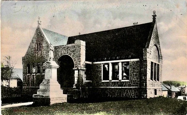
Porter Memorial Library, Machias, Maine. Hand-colored postcard.
Once again, an antique postcard yields memories as well as mysteries. My investment of $1.50 to buy an old card led to down-the-rabbit-hole ruminations.
Posted in Machias on Aug. 22, 1906 (Theodore Roosevelt was President); Maine had been a state for only 86 years. The sender, from what we can make out from the pencil scratches on the picture side of the card, was the sister of the recipient, Miss Edris Tillinghast. Tillinghast is a Rhode Island name, but Edris strikes one as one of those late Victorian family names, yet it is well enough known in Wales. Was Miss Edris visiting in Westerly? (Her address is in care of “Wm. Barnes, RFD” (Rural Free Delivery) – her family rusticating on a farm, perhaps)? Or was the sister traveling in far Downeast Maine?
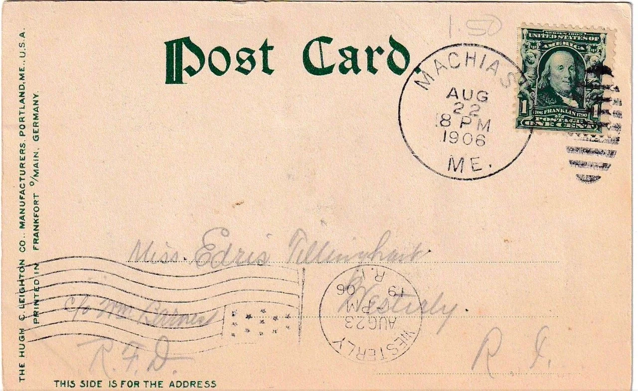
Post card from Hugh C. Leighton Co., Portland, but printed in Germany
The Tillinghast sisters and their undocumented peregrinations may had faded into the mists of time, but the library building in the Washington County seat has remained pretty much unchanged. Chicago businessman and Machias native Henry Holmes Porter gave the money to erect the library in memory of his father, Rufus King Porter, in 1891.
The architect of the Porter Library was George Clough, who hailed from Blue Hill, Maine, and was a successful practitioner in Boston. He designed the Suffolk County Courthouse, on Pemberton Square, Boston, and he was that city’s first City Architect, a position to which he was elected in 1876 and served for seven years. He also designed the public libraries for the Maine towns of Rockland, Bucksport and Vinalhaven.

Postcard of Buck Memorial Library, Bucksport.
Clough’s inspiration for Machias was the Romanesque Revival-style libraries of Henry Hobson Richardson in such suburban Boston towns as Woburn, North Easton and Quincy. Richardson was best known as the architect of Trinity Church at Copley Square in Boston, but his small-town libraries are among his most satisfying works. Clough was one of many New England library builders who borrowed from the Richardsonian formula of monumental reading room, wing for the stacks and ceremonial civic entrance.

Crane Memorial Library, by Henry Hobson Richardson, in Quincy, Mass.
-- Photo by William Morgan
Providence-based writer and photographer William Morgan is the author of a number of books on New England architecture, including A Simpler Way of Life: Farmhouses of New York and New England and Monadnock Summer: The Architectural Legacy of Dublin, New Hampshire.
William Morgan: It's time to retire stop signs

— Photo above by La Cara Salma

— Photos by William Morgan
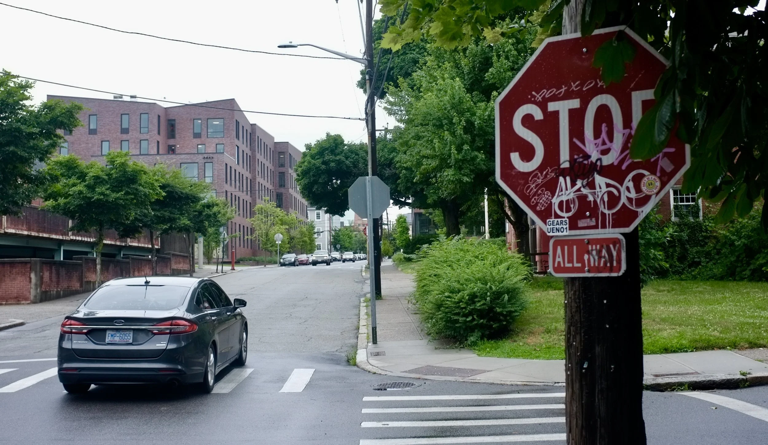
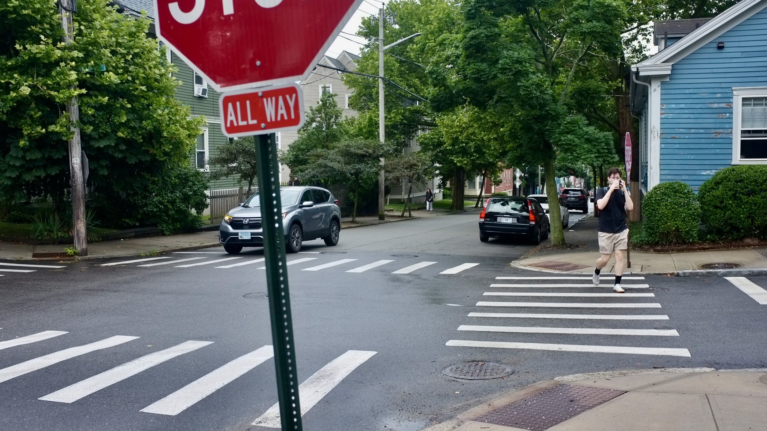
Let’s face it, the days of the stop sign are over. The stop sign is an anachronism, as are simple courtesy and turn signals. Nobody pays attention to them anymore, so why do we keep them around? A stop sign can be confusing to, say, older people who might actually come to a complete stop, thereby creating a hazard and slowing the progress of all the other drivers who either ignore or do not recognize the purpose of the red metal octagon.
Stand at a busy street corner for a few minutes and count the number of cars that do not heed the stop sign. My experience of such an exercise invariably shows that a majority of motorists sail right through intersections without stopping; they might slow down for a moment, perhaps hesitating, vaguely remembering a forgotten but once ingrained habit. During a recent brunch at a restaurant on a busy Providence corner, I watched as nine out of ten cars failed to stop. The particular location is a block from an elementary school, yet the presence of crossing guard hardly seems make a dent in transgressions.
Rhode Islanders are certifiably among the nation’s worst drivers–the drivers least likely to abide by traffic rules. But I expect disobeying stop signs is a common American phenomenon–no one expects us to drive like the Swiss or the Swedes. Perhaps there are some national characteristics–anti-authoritarianism, visual impairment, stupidity–that make us want to transform a reasonable few extra seconds of pausing into a game of automotive chicken.
Maybe there’s a plot by insurance companies to raise premiums, and there’s is an army of lawyers who flood the airwaves and crowd the sides of highways with billboards asserting that they can monetize your car crash.
Eventually, I will get rear-ended by a distracted mother in her Ford Subdivision or a hedge-funder in his Mercedes Afrika Korps, or mauled by a super aggressive-looking pickup truck, the drivers all texting. Until then, I will try to retain my belief that obeying traffic rules is part of a greater social contract. Yet the failure to heed stop signs suggests a larger breakdown of society as a whole.
Like the use of cell phones while driving (illegal in my state), such actions point to a lack of connection with the world around you and your species. If you don’t make eye contact with a pedestrian, a bicyclist or another driver, you are closing down an opportunity to interact with another human, a fellow citizen. When I slow down or pull out of the way on a narrow street so that an oncoming car can pass through, I rarely get an acknowledgment, a wave of the hand, a mouthed thank you. I am just some unimportant loser in an 18-year-old Volvo who ought to give way to the driver of a hurrying urban assault vehicle on a self-important mission. My wife, however, says I am just invisible.
In neighboring Massachusetts, stop signs at dangerous intersections are getting blinking lights around their perimeters. This seems to me like the third stop light that was mandated on cars a few decades ago–and we know how effective they have been on cutting down on tailgaiting. Such well-intentioned gestures are only short-term bandages putting off the eventual removal of all these useless stop signs.
Let the all-out free-for-all begin.
William Morgan is an architectural writer based in Providence. His latest book is Academia: Collegiate Gothic Architecture in the United States.

William Morgan: Why Providence is indeed one of the 'Best Towns'

The Rhode Island State House is just the crowning example of brilliant civic architecture in Providence. Few other American cities can match Providence in the richness of its architectural patrimony.
—- Photo by William Morgan
Providence got a welcome pat on the back when CNN Travel recently ranked it Number 2 on its list of “Best Towns in America To Visit’’; Richmond, Va. was Number 1. Our high scores included Art, Architecture, Design and Food (of the other nine cities, only Macon, Ga., got a nod for its historic buildings). Such a positive national spotlight on Rhode Island’s capital is briefly heartwarming, but it barely hints at why Providence is one of the best towns anywhere in which to live.
Americans seem obsessed with lists and rankings, most of which are so superficial as to be meaningless. The worst are the college ratings, which seem only to increase applications to fewer schools (often called “elite’’) and to create a general atmosphere of insecurity for all the rest. (Examples of criteria used: Last time I checked, The New York Times’s list of the 300 Best Colleges had Providence College dead last in terms of student diversity; the University of Chicago held the bottom rung on the ladder for social life.)
The Zumper real-estate study listed Providence as 98th in 100 spots for best city for this year’s college graduates. Such metrics as median rents and the unemployment rate produced findings giving top spots to far-from-the- ocean Minneapolis, Columbus and Oklahoma City, while admittedly much more vibrant cities with higher costs of living, such as Boston or New York, lagged far behind. Where are the rankings for character, for beauty, for soul?
Beacon Hill, Boston. Who would trade this for Grand Rapids or Duluth?
— Photo by Willliam Morgan
When I was a professor of urban studies at the University of Louisville, students would often ask me what makes a great city. Somewhat tongue in cheek, yet also in a way deadly serious, I said that a great city was one that poets would write poems about and to which musicians would write love songs (“I left my heart in Duluth” doesn’t work). A few other pedagogical chestnuts: All great cities are on water. Street life and the strength of the neighborhoods are key indicators of livable cities. And the acceptance in a city of its gay citizens is also a strong indication of its livability.

A collection of the author’s columns that he wrote as architecture critic of the Louisville Courier-Journal were published as this book.
When my wife, Carolyn, and I decided to leave Kentucky for a new home somewhere in New England, we tried to heed my own urbanism lessons. We agreed that we would seek the ideal place to live in, and then look for work, rather than let a job dictate where we would settle. We drew up a stringent list of urban wants, headed by proximity to the ocean and a city’s strong sense of its history. Needing to work, we wanted a city with several colleges and universities where we could teach.
Our ideal new hometown would have inviting sidewalks with interesting stores and restaurants alongside, including independent bookstores, and and with larger cities nearby. We craved ethnic diversity and a variety of cuisines. Most of all it had to look and “feel right,” with a distinguished collection of high-style and vernacular architecture, gathered together in a human scale. A preservation-minded mayor, the late Vincent “Buddy” Cianci, with seemingly off-the-wall ideas, played an important promotional role. He and other local leaders weren’t afraid to help arrange for the likes of Venetian gondolas and to light up a river.
Note that there were no econometrics in our city-search template.

WaterFire was one of the urban inventions that impressed this city shopper.
— Sketch by William Morgan
Size is not really an accurate gauge of a city’s desirability – CNN Best Towns are actually smaller cities, from about 50,000 to about 225,000 residents. One interesting aspect of the story, however, is that it uses the term town. The word seems to suggest something more accessible than canyons of concrete and glass.
In Britain, the people who shape metropolises are called town planners. Before consolidation into Greater London following World War II, the British capital had been a collection of 23 boroughs, each with its own government, identity and traditions. One thinks of Providence’s two dozen neighborhoods, from Silver Lake to Fox Point, collectively contributing to a lively mosaic instead of an Anywhere USA blanket of sprawl.

Great towns need boldness and innovative out-of-the-box thinking. Providence uncovered a river and moved an interstate highway.
— Photo by William Morgan
Let’s stop worrying about lists and ratings and simply strengthen those attributes that make a place beloved – attributes that Providence has in spades. Economic development has a major role, of course, but stressing monetary concerns over humanizing factors cannot ensure a high quality of urban life. And worse than lists are one-size-fits-all advertising, such as the current slick but trite “All that …” campaign. If Providence is an urban success, people will come to visit those who live here and who have helped make it one the best towns anywhere.

People connecting make a lively town, not statistics. Hope Street is the main drag of Providence’s East Side.
— Photo by William Morgan
Architectural historian, critic and photographer William Morgan has lived in Providence for 25 years. His latest book is Academia: Collegiate Gothic Architecture in the United States.
William Morgan: Big bargains and major mysteries at Savers
Photos, except for the picture of the author himself, by William Morgan
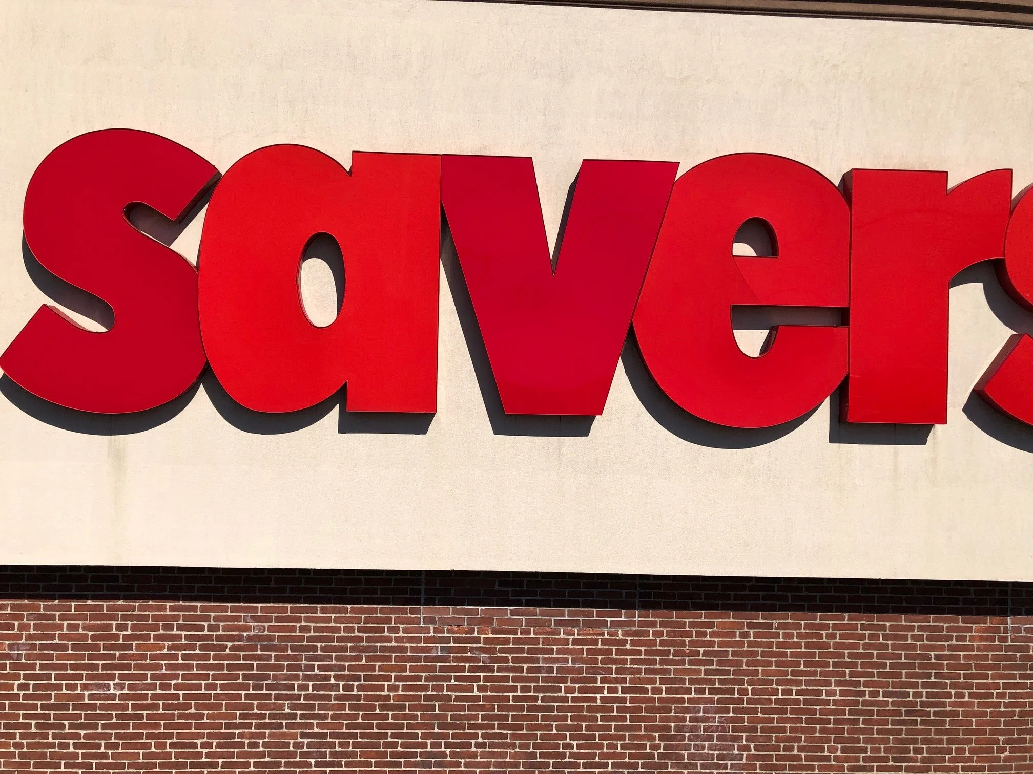
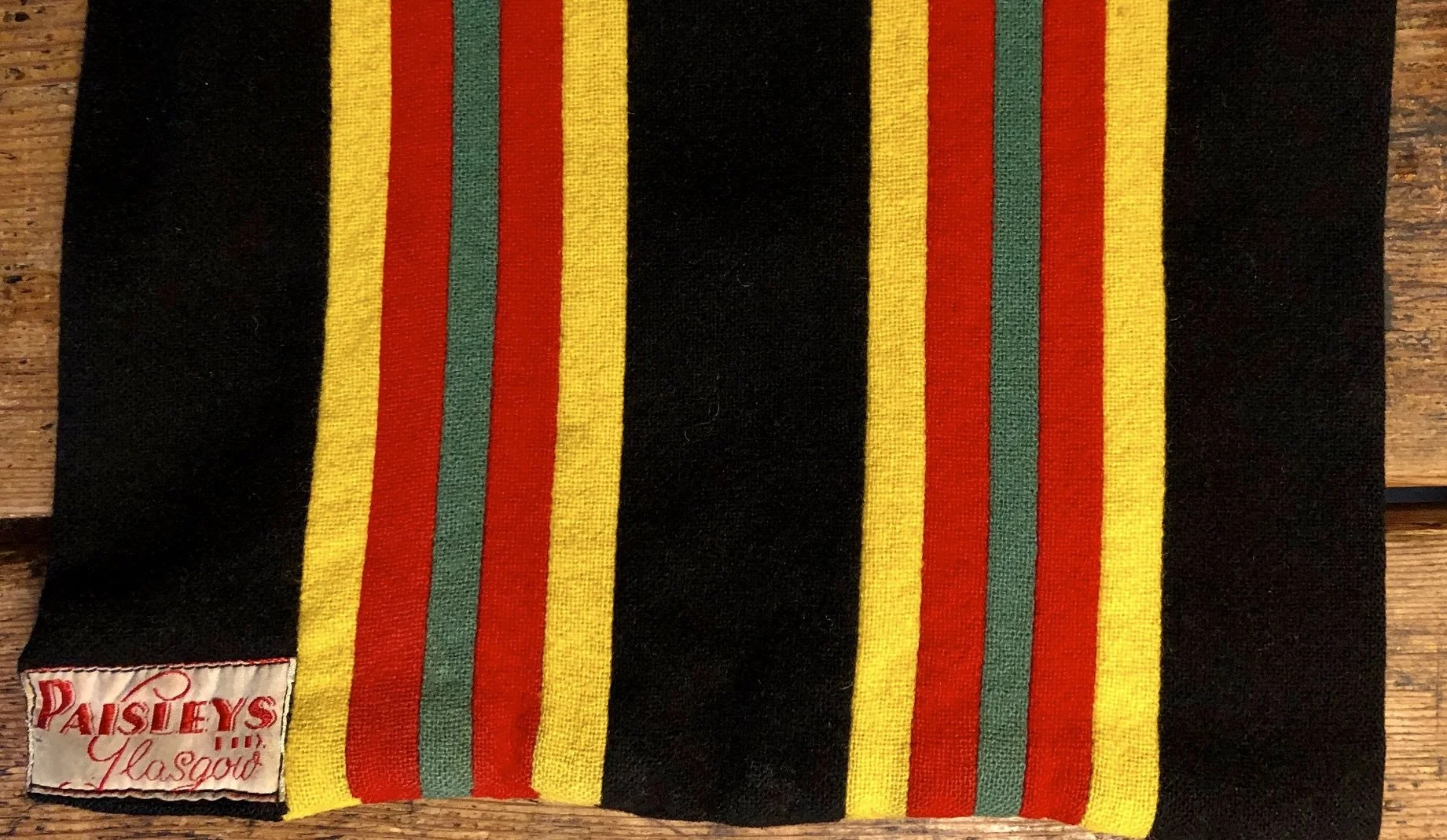
Savers (“make secondhand, second nature”) is the largest for-profit thrift retailer in the country, serving 29 states. There are a half dozen Savers close to us in Rhode Island and Massachusetts that we frequent, but the one on Branch Avenue at Interstate 95 in Providence is the motherlode. Since we discovered Savers, I cannot remember buying an item of clothing anywhere else. Where else could I find a Harris tweed jacket from Edinburgh for $9.99 or a university scarf from a Glasgow department store that closed in 1943 for $3.99?
That said, I hate to shop. So, when my wife, Carolyn, is in Savers in search of fabric with which to make clothes, tchotchkes to incorporate in art, or household furnishings for young newlyweds, I roam the bookshelves there (or what we call The Library). Then with a couple of British murder mysteries (mystery reading is an addiction, said W.H. Auden, like smoking or alcohol), I head for a comfortable chair or sofa in the furniture section (which we call The Lounge), where I settle in for some reading and likely a nap.

The author reading in Savers.
— Photo by Gabs Chioniere
Sometimes a napping man causes a stir, and once someone asked if I were dead. Other times, I may head outside to get away from the pervasive used-clothes smell. There’s not much room around our Savers to walk safely; still, beyond the cigarette butts, dental-flossing devices, and candy wrappers, the parking lot can yield some treasures. A recent perambulation suggested that there’s darker side to Savers: unsolved mysteries.

Why the abandoned trousers? An after-hours tryst interrupted and the pants left behind?

A dismembered ear? Presumably a discarded part of a Halloween costume (Halloween is huge at Savers). Although, at first glance, there is a suggestion of violence, as with the blue jeans. Instead of behind a bar in Arles, a contemporary Van Gogh and Gauguin had a knife fight outside of the thrift store.
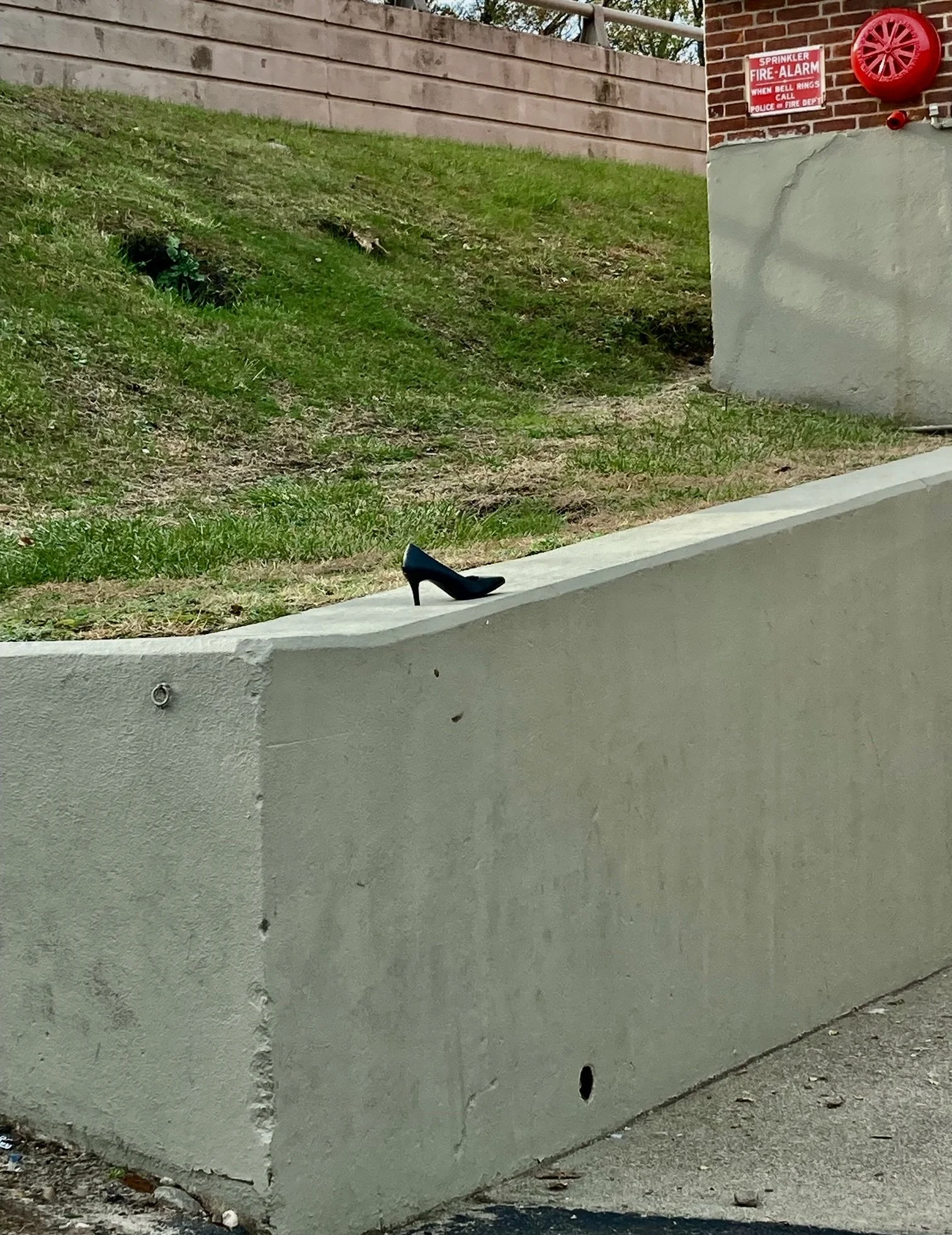
Most mysterious of all was a single high-heeled shoe abandoned at the edge of the Savers parking lot.
Was this pump left behind by a hasty Cinderella fleeing a wee hours ball held on the asphalt?
William Morgan is a Providence-based architectural writer. His latest book is Academia: Collegiate Gothic Architecture in the United States.

William Morgan: All that and nothing at all; how not to promote a state
The State of Rhode Island, beset by the self-inflicted woes of failing infrastructure, persistent corruption and a lack of self-confidence, has launched a new tourism initiative that it hopes will bring swarms of visitors to our shores this summer. “All That” is the campaign’s motto.

All That, period. What’s more banal than a lighthouse?
—Commerce Rhode Island
Despite its 1990s hip-hop vibe, the pandering of Rhode Island to potential visitors is clothed in familiar banal corporate-speak, accompanied by photographs of lighthouses and Newport mansions, with “All That” splashed across them.
There are videos showing young and happy revelers biking, surfing, dining – creepily identical to the branding firm’s clips on Belize, Park City, and other fun destinations–what you might expect from a Florida agency whose motto is “We make momentum happen’’.
Why does our culturally and geographically endowed Rhode Island need this everywhere -- and — everyone sanitized vision of itself?
Rhode Island is not the only state going through the periodic contortions of trying to sell themselves to mythical, profligate-spending hordes of tourists. Politicians are also easy marks for snake-oil salesmen of new images that they hope will appeal to the electorate.
(“All That”has apparently cost taxpayers half a million dollars, but queries through the Access to Public Records Act will no doubt reveal a much higher figure.)
Political appointments offer clues about the cluelessness of heads of state, so it should come as no surprise that Anika Kirble-Huntley, the chief marketing officer for Rhode Island Commerce, has spent her entire career in the casino industry.

Fun-Sized, perhaps, but what potential tourist would be enchanted by this murky and grim image?
—VisitRhodeIsland.com
“All That” is the fourth tourism re-brand fiasco in recent years. There was the embarrassing “Fun-Sized” campaign, and the slightly mysterious “Whatever you do …” The most infamous, however, was when Rhode Island hired design-great Milton Glaser to come up with the tepid slogan “Cooler and Warmer,” complete with a clip of alleged local skateboarders zipping along the harborside – in Reykjavik. Slightly less egregious was “Discover Beautiful Rhode Island,” whose chief legacy is handsome signs positioned at the state line.
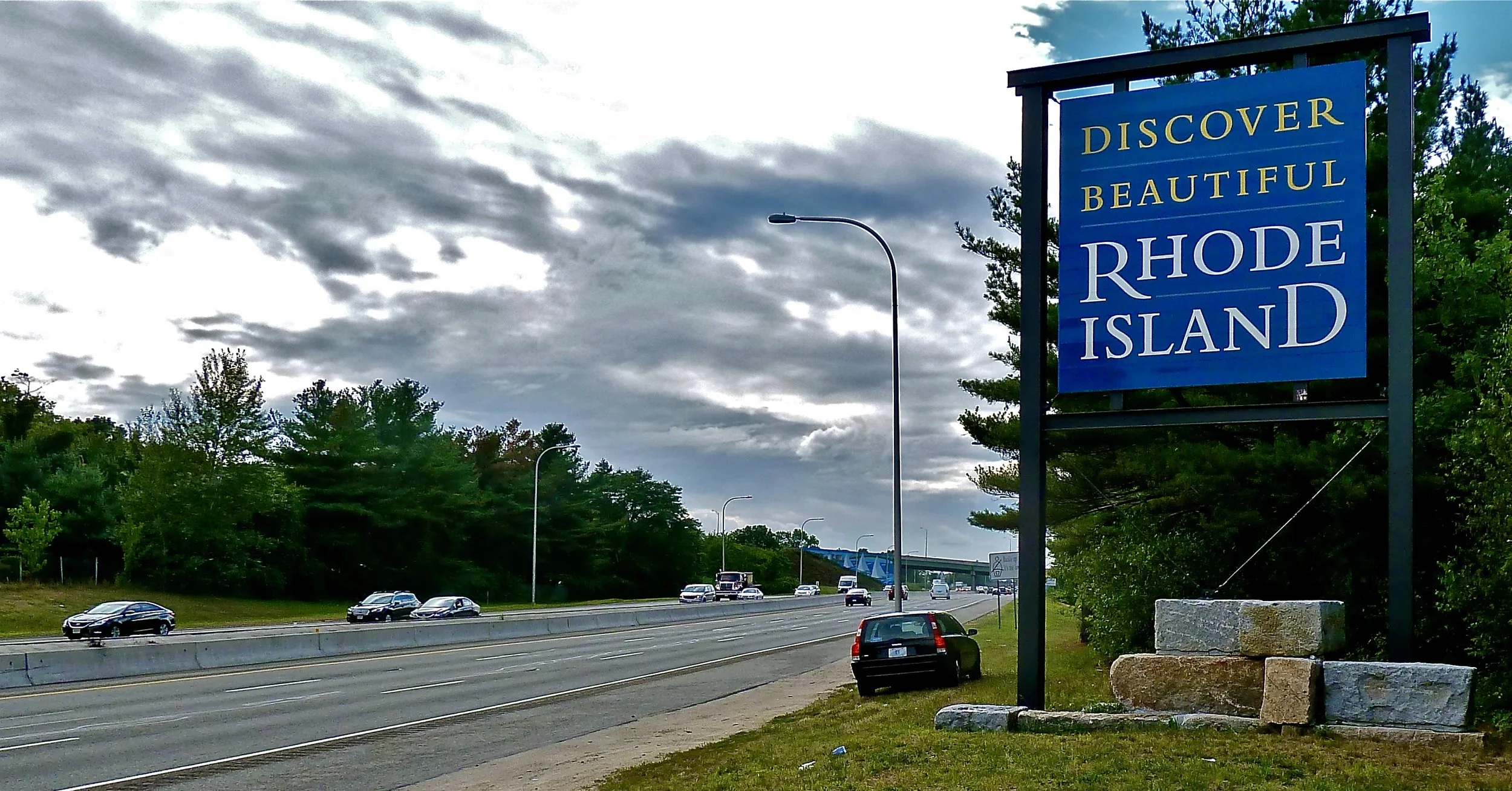
A quiet sign exhorting Rhode Islanders to discover where we live; tourists on I-195 are in a rush to get to Cape Cod.
— Photo by William Morgan
Rhode Island, to which my wife and I moved to by choice twenty-five years ago, may be the smallest state by area, yet it boasts 400 miles of Atlantic shore, a rich 400-year history seen in an incredible array of outstanding architecture. We were enchanted by Rhode Island’s diversity, its food, its educational institutions, and its palpable tradition of independence and tolerance.
Content with Rhode Island, I do not envy any state its bigger size. But, at the other side of the continent, I am in awe of Alaska’s waving identifier. It is an impeccable and unimpeachable symbol, perhaps the best advertisement for any American government entity. There are no mottos, no Latin phrases, no animals, or any potentially controversial figures – just a tribute to the northern sky.
The blue field with the gold stars of the Big Dipper pointing to the North Star, is a simple, strong, and recognizable design that has served boldly for a century, from territory to 49th state. This powerful, no-nonsense banner, adopted in 1927, will look fresh in another hundred years. Part of the brilliance of the design lies in its genesis: the American Legion sponsored a competition among school students throughout the territory that brought forth 700 entries. The winner was Benny Benson, a Native Alaskan orphan. For his brilliant scheme Benson was given a gold watch and $1,000. As “All That” demonstrates, the price of re-branding has gone way up, and handsome civic design is mostly a thing of the past.

The flag of Alaska, designed almost a century ago.
Rhode Island would have been better served by giving the money spent on the advertisements to folks to enable them to host visitors. The people who run the state gravitate to bigger scams, such as pro-sports stadiums, movie studios, and dubious highway contracts. Citizens will never see much of this squandered money again, even though we will be underwriting it for decades. Nevertheless, it is time to stop wasting dollars on silly, meaningless, and dubiously ineffective tourism promotions. Like the Alaska flag, Rhode Island itself ought to be advertisement enough.
William Morgan is an architectural writer based in Providence. His latest book is Academia: Collegiate Gothic Architecture in the United States (Abbeville).

Going medieval
Adapted from Robert Whitcomb’s “Digital Diary,’’ in GoLocal 24.com
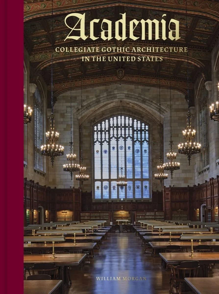
In reading William Morgan’s brilliantly written and gorgeously illustrated new book, Academia – Collegiate Gothic Architecture in the United States, you might recall Winston Churchill’s famous line: “We shape our buildings; thereafter they shape us.’’
I thought of this looking back at an institution I attended, a then-all-boys boarding school in Connecticut called The Taft School, founded by Horace Taft, the brother of President William Howard Taft. Its mostly Collegiate Gothic buildings made some of us students feel we were in a hybrid of a medieval church and a fort. This, I think, encouraged a certain personal rigor and seriousness of purpose, amidst the usual adolescent cynicism and jokiness.
The blurb from the publisher (Abbeville Press) summarizes well the book:
"Academia provides the ultimate campus tour of Collegiate Gothic architecture across the United States, from Princeton and Yale to Duke and the University of Chicago. It tells the surprising story of how the Gothic style of Oxford {whose origins go back to 1096} and Cambridge {founded in 1209} was adapted and transformed in the United States, to lend an air of history to the country’s relatively young college and prep school campuses. And it shows how Collegiate Gothic architecture, which flourished between the Gilded Age and the Roaring Twenties {into the Thirties, too}, continues to define the popular image of the college campus today—and even inspire new construction.’’
The style originally reflected a certain Anglophilia embraced by some American nouveau riche as they accumulated fortunes in a rapidly expanding economy. Rich donors, and the institutional architects they got hired, wanted to create buildings evoking kind of elite, aristocratic culture at certain old Protestant colleges and universities and private boarding schools. (Many of the latter were modeled on English boarding schools catering to the aristocracy.) There was often a lot of snobbery involved. But the style spread to other institutions, too, including businesses and government offices, around the country.
Some of this included fantastical (to the point of silliness) ornamentation and instant aging of stonework to suggest the wear of centuries on what were brand-new buildings, perhaps most flamboyantly at Yale. Get out those gargoyles!
The nearest major Collegiate Gothic campus to Providence is the Jesuits’ beautiful Boston College in Chestnut Hill, just outside of Boston.
Some institutions mostly stuck with the simpler and cheaper Georgian brick style (in New England that includes even mega-rich Harvard and merely rich Dartmouth and Brown) but Collegiate Gothic was a huge thing for decades, and much of it was beautiful. Even today, architects are designing, sometimes ingeniously, new applications of the style.
This book is about much more than architecture. It’s also about personalities, many of them colorful, class, including social climbing, Western civilization, economics, materials, politics and many other things.
One of the book’s joys is Mr. Morgan’s footnotes, which besides adding to the understanding of the main text, are often very entertaining, sometimes even hilarious.
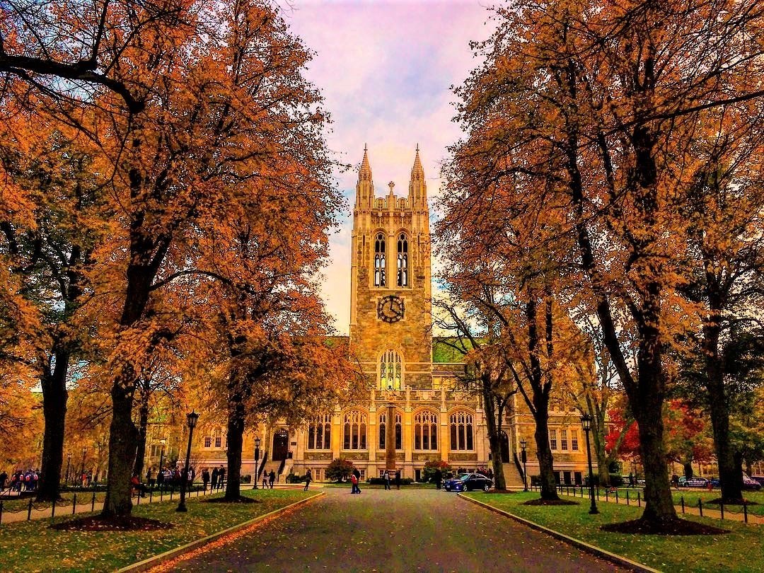
Gasson Hall, at Boston College, in the Chestnut Hill section of Newton, Mass., an example of high Collegiate Gothic architecture
— Photo by BCLicious
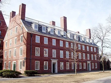
Massachusetts Hall at Harvard University, an example of the sort of Georgian Brick architecture that was the most common alternative on campuses to Collegiate Gothic.
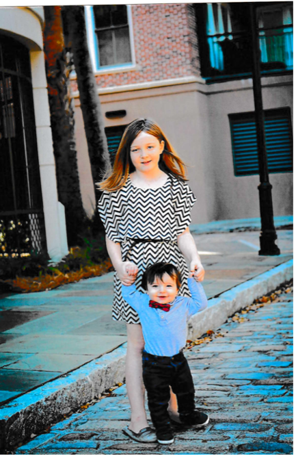
Will Morgan: A mystery photo and missing memory

Half a dozen years ago, our current president published a book about his son’s death from glioblastoma. Titled Promise Me, Dad: A Year of Hope, Hardship, and Purpose, started with Beau Biden’s plea to his father not to let grief overcome him. (The loss of the Delaware senator’s wife and daughter in a car accident in 1972 almost derailed Biden’s life, including his political career.)
I found an autographed copy of the book, simply inscribed “Joe Biden,’’ in Savers in Boston’s West Roxbury for $4.49. The forgotten best seller did, nevertheless, offer a treasure, the mystery photo above.
There are almost no clues as to the identity of this young girl and, presumably, her younger brother. It’s printed on Kodak Xtralife II paper, but who uses prints in this age of computers and online libraries? The buildings look recent – faux Georgian – although the cobblestone street could be European.
Looking at the lass’s auburn hair and complexion, we could guess that these children are Irish.
There’s a story here, at least in our imaginations. But, promise me, Dad, that you will date your photos and tell us why images like this represent a memory worth keeping.
An architectural and photo historian, William Morgan is a frequent contributor to New England Diary. His latest book, Academia: Collegiate Gothic Architecture in the United States, will be published in October.
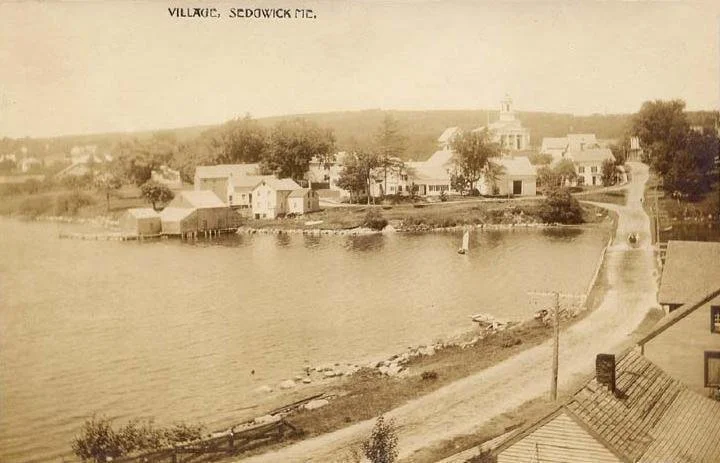
Downeast joys

Above, Treasures and Trash Barn in Sedgwick, Maine
Below, now closed lobster shack on Isle au Haut, an eatery once famous for its prize-winning lobster rolls.
— (The new!) photos by William Morgan
1908-1909 photos

Summer jump start
Photo by Willliam Morgan taken in Acushnet, Mass.

The Long Plain Museum, in Acushnet, was built in 1875 as the Long Plain School House. The school closed in 1972, and the building was then reopened as a local history museum, now operated by the Acushnet Historical Society.
The museum features four rooms focusing on the Acushnet whaling heritage, the blacksmith trade, period clothing and furniture, numerous other artifacts and a restored schoolroom.
The Long Plain is a local outwash glacial deposit of sand and gravel.
A downtown homeless person classically draped

— Photo and text by William Morgan
It’s 11 on a Saturday morning in downtown Providence, and someone is sleeping in. This stretch of Chapel Street between Grace Church and the Providence Performing Arts Center has two or three encampments, where building-entrance alcoves provide a modicum of shelter from the elements.
The sadness and embarrassment of homeless people, and the failure of a supposedly enlightened city to take care of its marginalized and less fortunate, tear at one’s heartstrings.
Whatever the issues around social conscience and civic breakdown, some credit is due to this intrepid street denizen. He or she is wrapped in an ecclesiastical purple blanket, like a giant burqa without eye holes. The draping of the fabric recalls classical Greek statuary, such as the Elgin Marbles, from The Parthenon.
As I passed, from a tent pitched in the next entryway, a female voice wafted out, “Have a nice day.’’
William Morgan is an architecture writer and historian based in Providence. His latest book, Academia: Collegiate Gothic Architecture in the United States, will be published in October.
Grandeur or at least mystery at Good Fortune

— Photo and text by William Morgan
At a time when most public art is too realistic, too political, and just too awful, it can be a pleasure to stumble upon some unplanned artistic achievement– art in spite of itself.
This urinal in Good Fortune, the giant warehouse of Asian food in the Elmwood section of Providence, offers humor, dignity, and an appropriate aura of mystery befitting an intriguing work of art.
This plumbing fixture is broken, but the sign, “Operation Suspended,’’ hints at grander exploits, such as the cancellation of a moon shot or an aborted Navy Seals raid.
Set off by faux marble and black poly-something-or-other, the flushing mechanism takes on the look of a sleek, abstract chromium sculpture – a tribute to American industrialization, perhaps. A dismembered torso, or perhaps a tuxedo on a coat hanger, lurks beneath the shiny, elegant, mink-coat-black drape.
High fashion or a postponed plumbing repair?
William Morgan is a Providence-based writer and architectural historian. He holds a Ph.D. in American Art from the Bidens’ alma mater, the University of Delaware. His latest book, Academia: Collegiate Gothic Architecture in the United States, will be published this fall.
#art #Providence

Homeless and classically draped
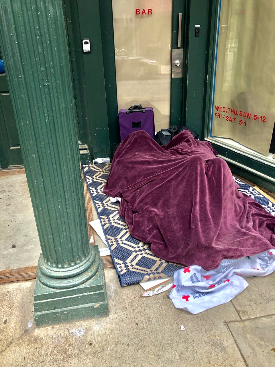
Photo and text by William Morgan
It’s 11 on a Saturday morning in downtown Providence, and someone is sleeping in. This stretch of Chapel Street between Grace Church and the Providence Performing Arts Center has two or three encampments, where building-entrance alcoves provide a modicum of shelter from the elements.
The sadness and embarrassment of homeless people, and the failure of a supposedly enlightened city to take care of its marginalized and less fortunate, tear at one’s heartstrings.
Whatever the issues around social conscience and civic breakdown, some credit is due to this intrepid street denizen. He or she is wrapped in an ecclesiastical purple blanket, like a giant burqa without eye holes. The draping of the fabric recalls classical Greek statuary, such as the Elgin Marbles, from The Parthenon.
As I passed, from a tent pitched in the next entryway, a female voice wafted out, “Have a nice day.’’
William Morgan is an architecture writer and historian based in Providence. His latest book, Academia: Collegiate Gothic Architecture in the United States, will be published in October.
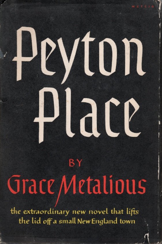
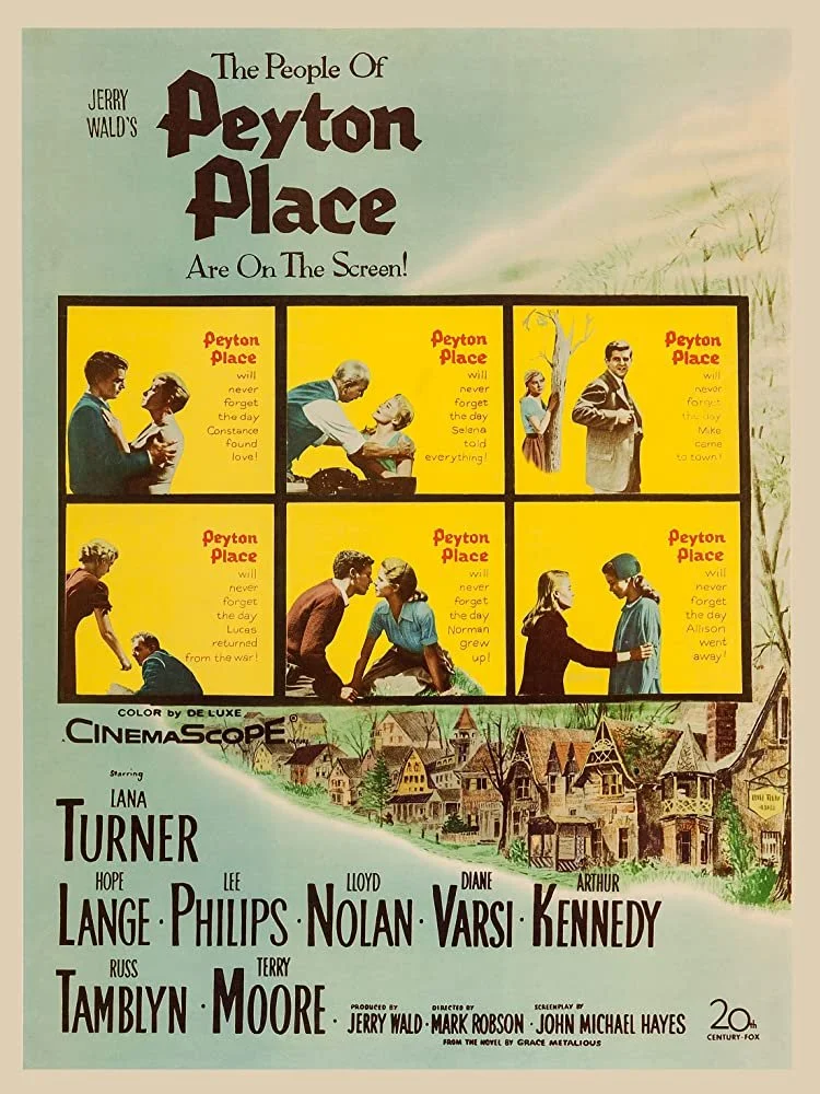
Take a left for scandal

In New Hampshire’s Lakes Region: G.I.W. refers to the village of Gilmanton Iron Works, in Gilmanton, the model for Peyton Place, the town in the once scandalous 1956 novel of the same name by Grace Metalious. Gilmanton Irons Works is named for a long-gone unprofitable mining operation.
— Photo by William Morgan
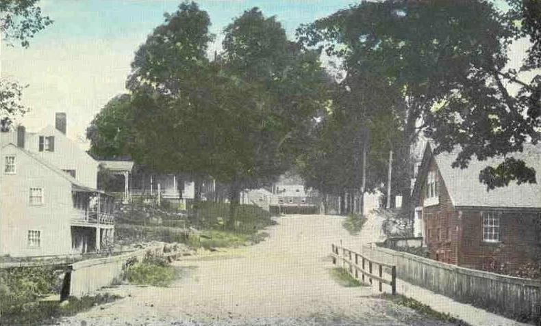
In Gilmanton: Iron Works Bridge in 1910.
Existential confusion
Inside Greg’s Famous Seafood, in Fairhaven, Mass.
— Photo by William Morgan
William Morgan: Where obscurity may have helped save some of a town’s beauty
Photos by William Morgan
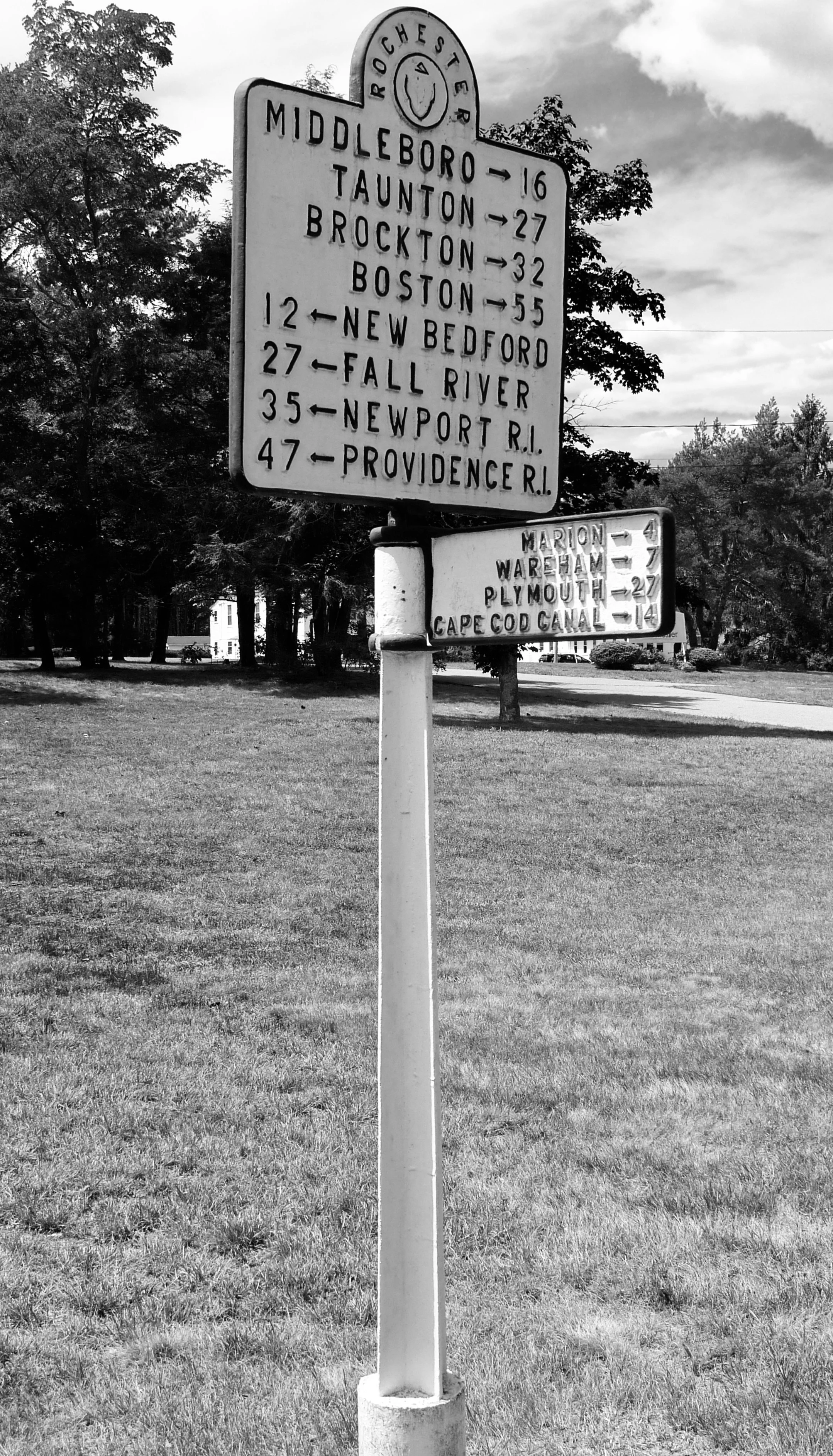
The signpost on the green in Rochester, Mass., tells you how far you are from various Bay State towns. The attractive, old-fashioned marker also hints that this place is the back of beyond — the middle of nowhere.
Rochester wasn’t always a place forgotten. First settled in 1679, it was a major shipbuilding town, at least until what became Marion and Mattapoisett broke away and Rochester became landlocked.
There are a few handsome Federal period houses dotted about the countryside, no doubt remnants of maritime wealth before New England commerce was strangled by Jefferson’s Embargo Act of 1807.

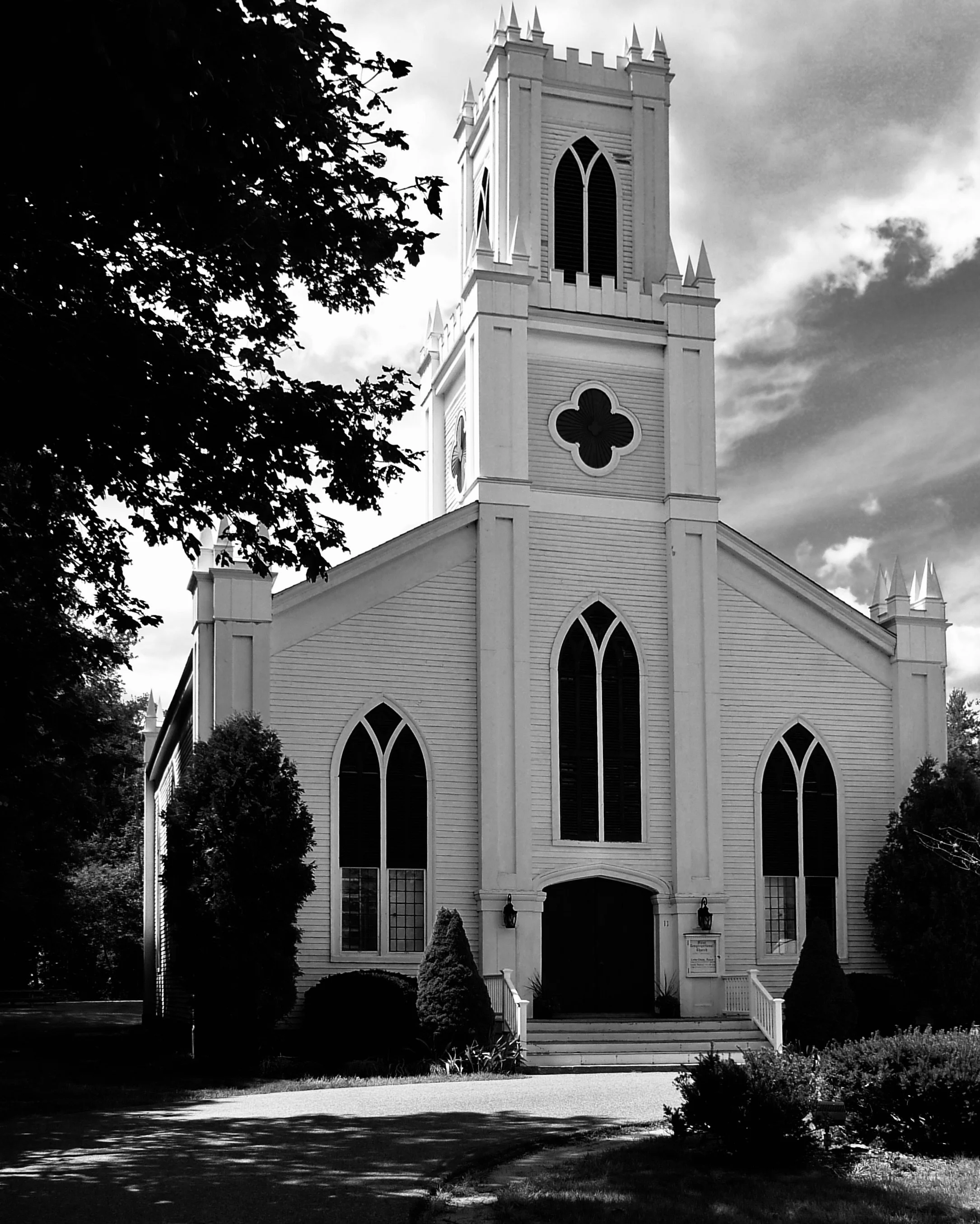
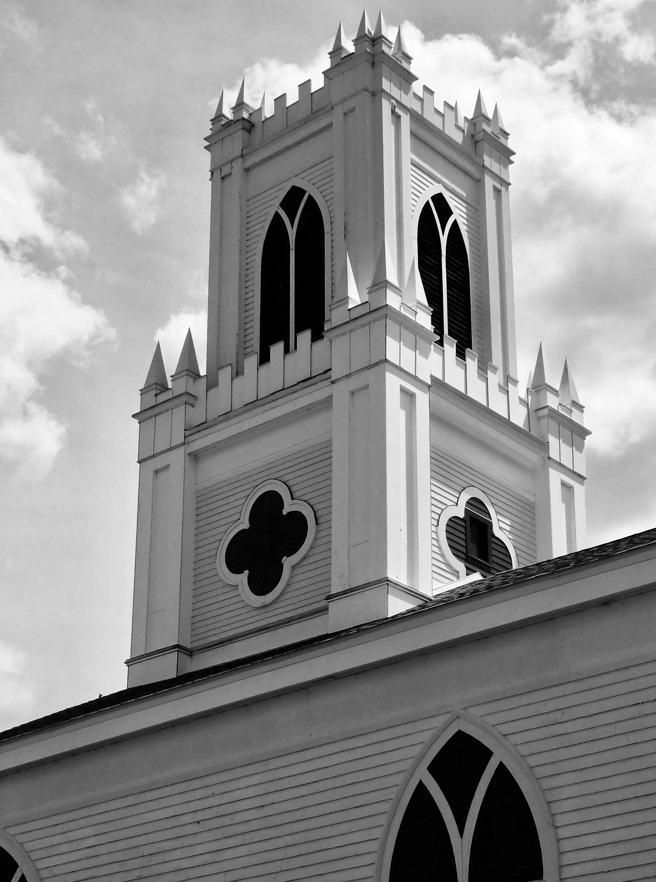
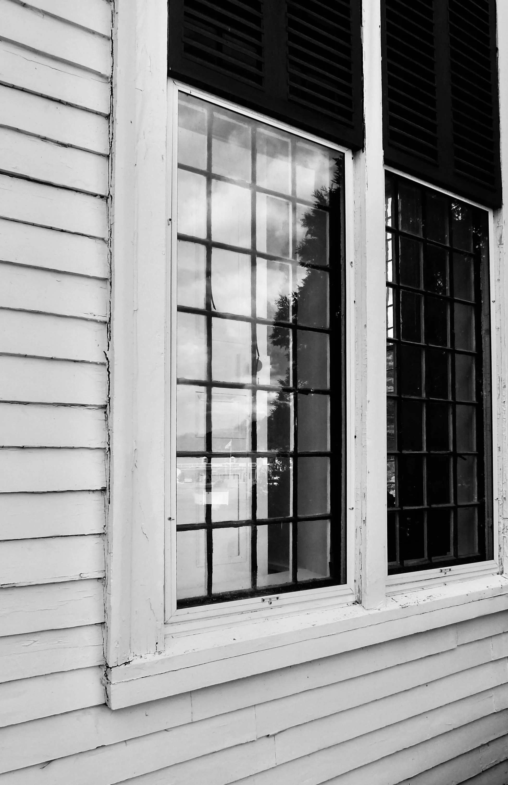
Rochester’s town common boasts a marvelous Carpenter’s Gothic church. The church’s foundation goes back to 1703, but this confection dates to the middle of the 19th Century. The First Congregational Church’s medievalism is a riff on the typical New England Meeting House: a simple preaching box with a battlemented tower instead of a multi-tiered Georgian steeple.
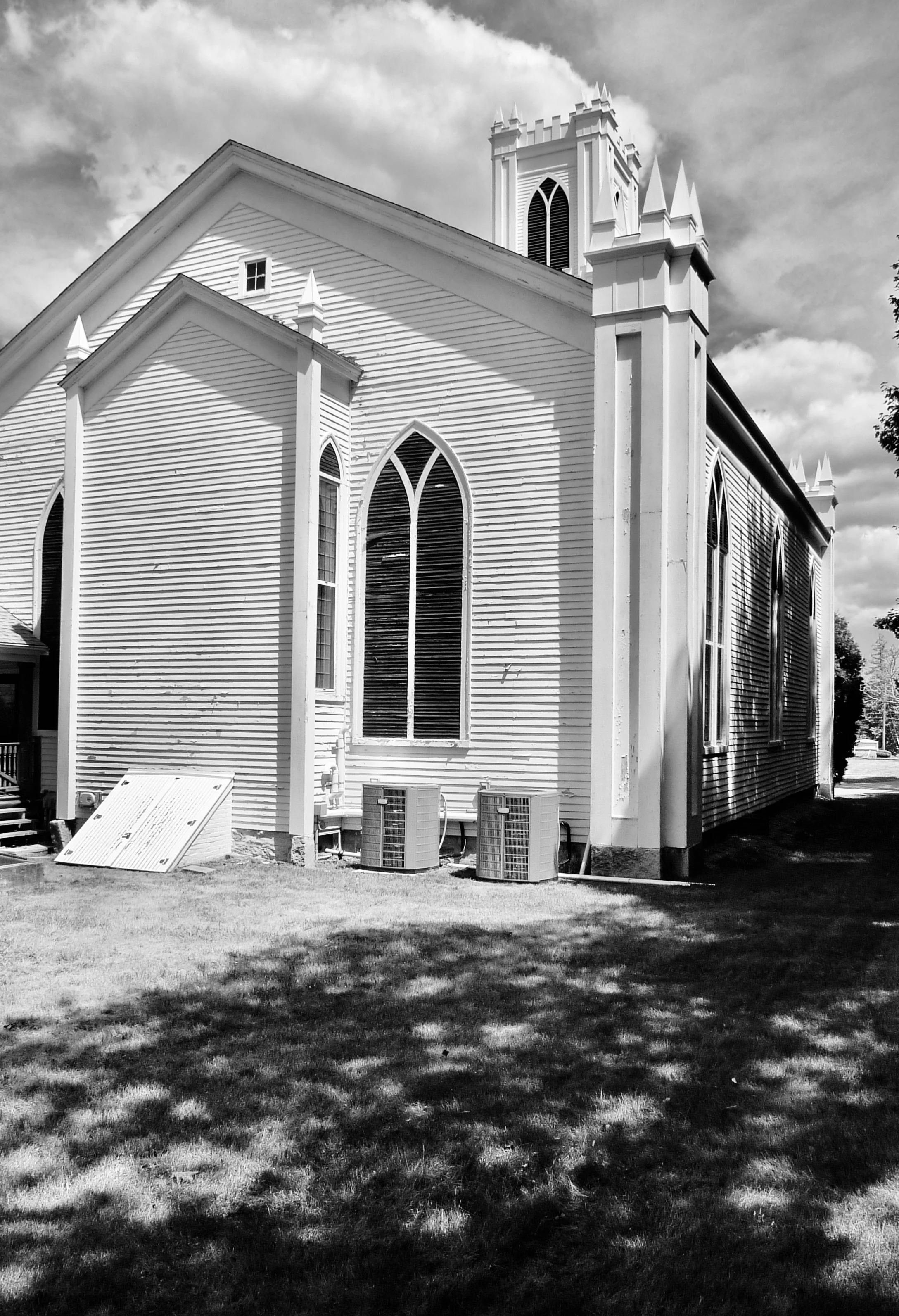
There are no great masonry walls or expanses of stained glass. The meeting house windows have pointed tops, the tower base has louvered openings in the shape of quatrefoils, and the corners of the parapets have spikey caps
The delightful First Congo is not going to make up for the loss of access to Buzzards Bay. But the town’s very misfortune may have preserved this treasure.
William Morgan is a Providence-based architectural critic and historian and photographer. He is the author of American Country Churches and The Cape Cod Cottage, among other books.

Poor Rochester (in red) — so near Buzzards Bay but cut off. Orange is Plymouth County.